Product Ideation · Vijaybhoomi University

The hour of silence

Visitors to our campus often wait at the gate for a long time. They are waiting for someone to approve their visit. I studied why this happens, designed a fix, tested it with eight people, and rebuilt it.

By
Bhargavaram Krishnapur
Research
31 July to 5 August 2026
People
3 interviews · 8 card sorts · 5 tree tests
Design
16 wireframes · Figma prototype
Testing
8 people · 16 to 17 September 2026
Demo
Try the rebuilt app

The study in one minute

The visit
A mother drove three hours to see her son. She filled in the entry form an hour early, from the car. She still waited at the gate in the rain for twenty minutes. She got in after a guard phoned someone.
The problem
After a visitor sends the form, nobody has to answer it. There is no time limit. If nobody answers, the request is cancelled and the visitor must start again.
My solution
Visitors fill in five fields from anywhere. The system sends the request to the right person. Visitors can see who has their request. If nobody answers in 30 minutes, the request moves to a backup person on its own.
What I made
Sixteen wireframes, a heuristic inspection that led to three fixes, and a clickable prototype in Figma. Go to the design.
What testing showed
Eight people tried the prototype. 97% of tasks were reported as done, but only 44% of answers showed that the person understood the screen. Five of eight thought a sent request was already approved. Go to the results.
What changed
I rebuilt the app as a working web page and fixed the problems that testing found. You can try it on this page. Go to the demo.
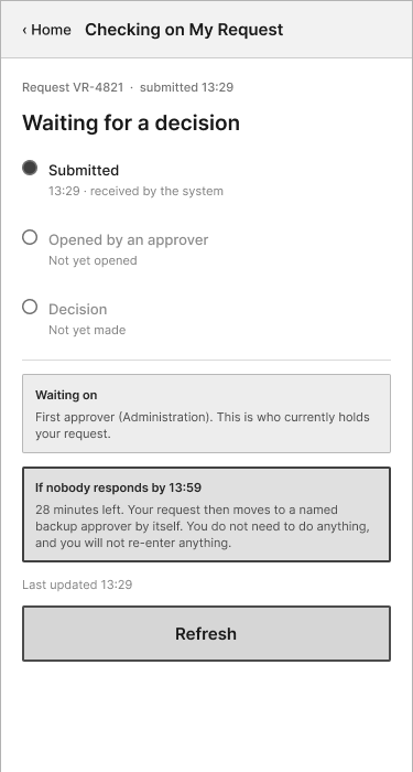
Wireframe of the proposed status screen. It shows three stages: Submitted, Opened by an approver, and Decision. It says the request is with the first approver, and that if nobody responds by 13:59, in 28 minutes, the request moves to a backup approver by itself.
The status screen I designed. The current system has no screen like this.

How visitors get in today

Every visitor fills in a six-screen form made by an outside company. They fill it in at the gate. Then they wait for someone inside the university to approve it. After that, a pass arrives on WhatsApp.

Four things make this hard:

  • There is no signal at the gate. The campus has no mobile data. The WiFi needs a coupon, and you can only get the coupon inside. Guards used to let visitors use a hotspot. That is no longer allowed.
  • The form’s QR code is at the gate. Most first-time visitors learn about the form only when they arrive.
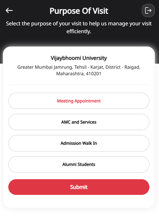
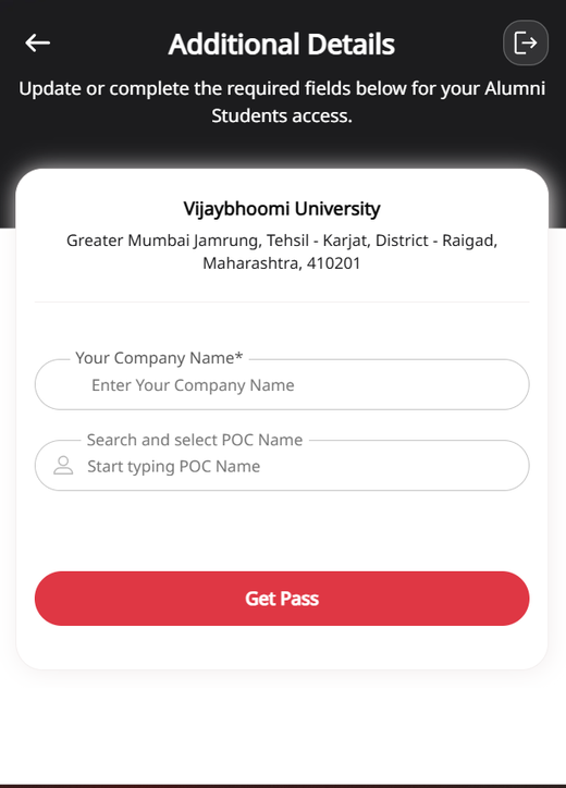
  • Parents have no option to pick. The form offers four reasons for a visit. None of them fit a parent. Then it asks for a company name.
  • Visitors must guess who approves. Teachers used to approve visits. Now only a few office staff can. The form still lets you pick someone who cannot approve, and it shows no error.

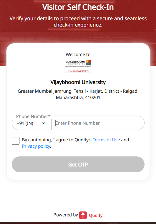
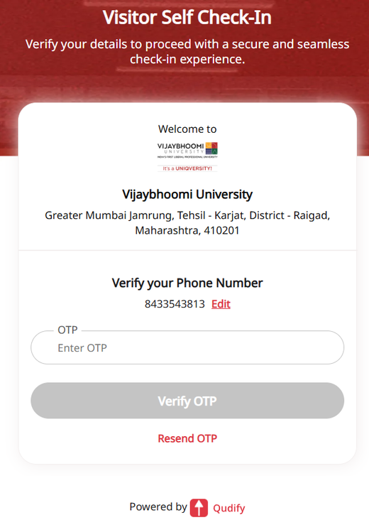
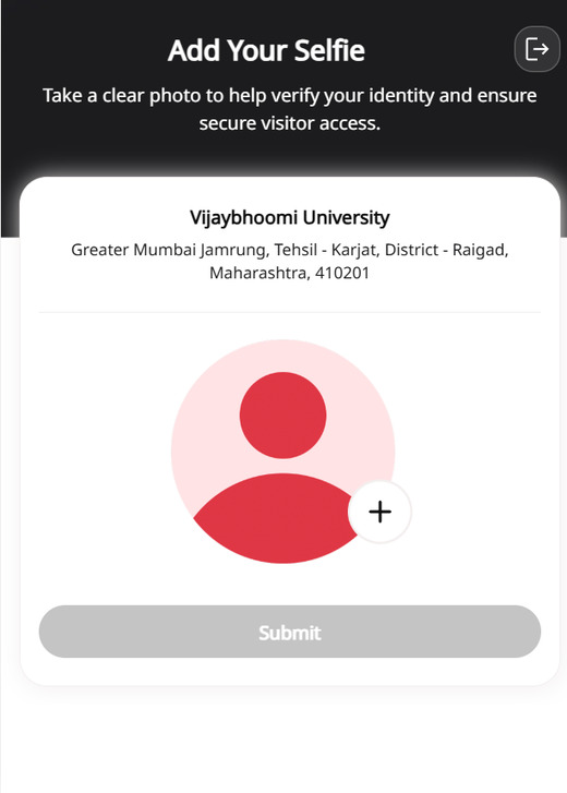
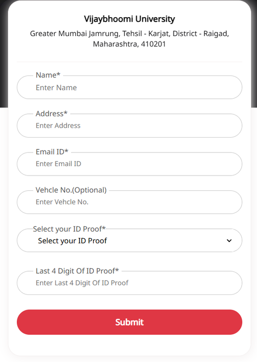
The six screens below belong to the current system. I captured them as evidence. My own design is in Phase 4.

Current system, screen 1 of 6: phone number entry with a terms of use checkbox. Current system, screen 2 of 6: one-time password check. Current system, screen 3 of 6: a required selfie. Current system, screen 4 of 6: personal details, including name, address, email, ID proof type and the last four digits of an ID card. Current system, screen 5 of 6: purpose of visit, with only Meeting Appointment, AMC and Services, Admission Walk In, and Alumni Students. Current system, screen 6 of 6: a required company name and a point of contact name.
The form asks for eleven or more things. The guards’ paper register keeps only five: name, phone, address, reason and signature. The guards do not use the rest to decide who comes in.

Who I talked to

CodeWhoWhat I did
P1Visiting parentRecorded her story, then sent written questions
P2, P3Two gate guards, on different shiftsInterviewed each one alone, in Hindi, about 10 minutes each
R2–R96 students, 1 past visitor, 1 otherOnline card sort with 20 cards
TT1–TT55 students who did not do the card sortPaper tree test with 8 tasks

I use these codes only here and under the evidence photos. The two guards gave almost the same answers. So the problem happens every day, on every shift.

Limits of this study: a small group, mostly students, and I was part of the story
  • The student in the parent’s story is me. I count it as my own observation, not as a separate interview.
  • I got nine card sorts and needed ten. I removed one that put all 20 cards in one group in 60 seconds. I set that rule before I looked at the results. That left eight.
  • I found people through my own friends and classes. Only one card-sort person had been a visitor but never a host.
  • All five tree testers were students. Some tasks asked them to act like a parent.
  • I translated the guards’ answers from Hindi myself.

What I guessed, and what I found

Before the research, I wrote a proto-persona: my guesses about a visiting parent. The research proved all four guesses wrong.

Proto-persona (my guesses) and the evidence-based persona
My guessWhat the research showed
She finds apps hard to useShe filled in six screens correctly, twice, in a moving car
The long form upsets her mostShe accepted the form. The waiting after it upset her most
She waits about 20 minutesShe waited over an hour, applied twice, and had one request cancelled
She wants to get in fastShe wants to know for sure she will get in. Being turned away costs her a six-hour round trip

P1, “The Prepared Visitor”

Homemaker, 40 to 50 · three-hour drive each way · visits often · comes on Fridays at lunch, when her son is free

She had four advantages most visitors do not have. She knew about the form. Her son sent her the QR code from the gate. She started an hour early. And her son was on campus to help. She still waited over an hour.

I was thinking whether I would be allowed inside or not that day.

Visiting parent

Her day, step by step

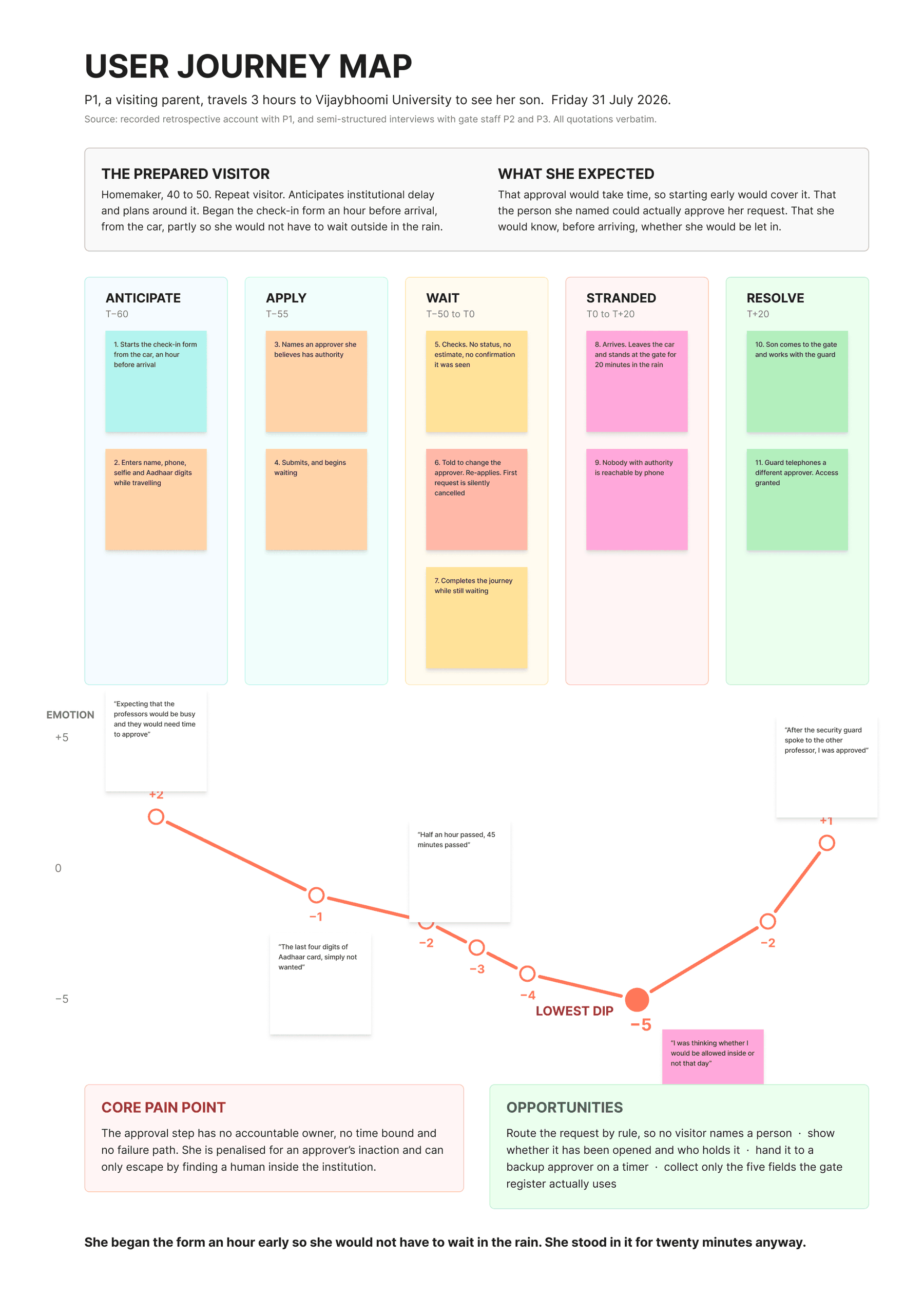
The number on the right is how she felt, from +5 (great) to −5 (terrible). The times count from when she reached the gate.

  1. 1 hr beforeStarts the form from the car, so that she does not wait in the rain+2
  2. 55 min beforeTypes her phone, selfie and Aadhaar digits. She dislikes giving the ID−1
  3. 50 min beforeSends it. Waits. Nothing tells her if anyone has seen it−2
  4. 20 min beforeTold to pick a different approver. Applies again. The first request is cancelled−3
  5. 15 min beforeStill waiting as she drives. Her extra hour is gone−4
  6. At the gateStands in the rain for 20 minutes. Nobody who can approve answers the phone−5
  7. 20 min afterHer son walks to the gate. A guard phones a different approver−2
  8. 25 min afterApproved. She walks in+1

Her visit, mapped

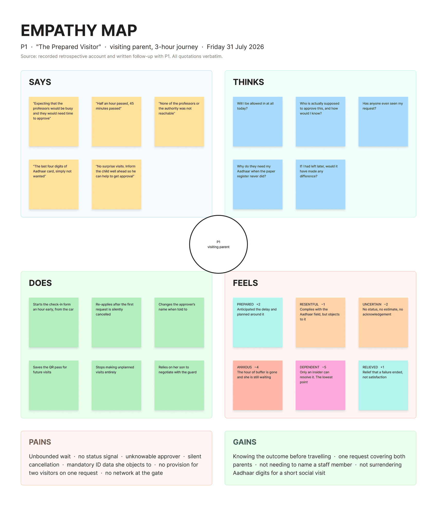
I built both maps in FigJam from her recorded story and the guard interviews. Every quote on them is in her own words. Tap a map to open it full size.

Empathy map for the visiting parent, built in FigJam with four sections. Says holds her own words, such as half an hour passed, 45 minutes passed, and the last four digits of Aadhaar card, simply not wanted. Thinks holds questions such as will I be allowed in at all today, and has anyone even seen my request. Does lists starting the form an hour early, applying again after the first request was cancelled, and relying on her son. Feels runs from prepared, plus two, down to dependent, minus five, then relieved, plus one. Pains and gains sit at the bottom.
Empathy map. What she said, thought, did and felt. Her lowest feeling was dependent: she got in only because someone inside helped her. Open full size.
User journey map built in FigJam across five stages: Anticipate, Apply, Wait, Stranded and Resolve. Eleven numbered steps run from starting the form in the car to a guard phoning a different approver. Below, an emotion line starts at plus two, drops to its lowest point of minus five while she stands at the gate in the rain, then rises to plus one when she gets in. The core pain point and ideas for fixes sit at the bottom.
Journey map. Her feelings start high because she felt ready. They drop to the lowest point while she stands at the gate. Open full size.

The core pain point

The approval step has no one in charge, no time limit and no backup plan. If the approver does not answer, the visitor just waits.

A shorter form lifts only step 2 on her journey, from −1 to 0. Her worst moment, at the gate, stays at −5. That moment comes from the approval step.

Three sources agree. Even the guards do not know who approves:

Very difficult to figure out whom to ask approval for, especially when a parent is visiting.

Visiting parent

“Who should I ask approval from?” is one of the three questions visitors ask us most.

Gate guards

If they lift up the call, all well and good. If not, the guests just keep waiting.

Gate guards

Five things visitors need

  1. As a visiting parent, I want to see if someone opened my request and who has it, so I know whether to keep waiting.
  2. As a visiting parent, I want my request to go to a backup person if nobody answers in time, so one busy person cannot leave me stuck.
  3. As a student, I want to ask for my guest’s visit ahead of time, so my guest does not need mobile data at the gate. The student asks. Office staff still approve.
  4. As a visiting parent, I want the system to find the right approver, so I never have to guess a staff name.
  5. As a visiting parent, I want to give only what the gate register needs, so I do not hand over my ID digits and a selfie for no reason.

How people group the features

I made 20 cards, one for each thing the system can do. Nine people sorted them online into six groups. They were also free to say a card fit no group, or make up a new group. Eight results were usable. Three things stood out.

  1. Everyone agreed on “my request status”

    All eight people put “see if my request has been opened” and “see how long a decision takes” in the same group. People clearly want one place to check their request. The current system has no such place.

  2. People had never seen a backup approver

    Half the group (4 of 8) said “pass the request to a backup person after a set time” fit no group. They had never used a system that does this. Still, one person came up with the same idea on their own:

    Time to respond. After which the visitor can seek help.

    Card-sort participant
  3. A vote can hide confusion

    “Add another visitor to the same request” won 5 of 8 votes. But three people also said it was the hardest card to place. The numbers made it look settled, and it was not.

Two more results: visitors and students want different things, and my form had a flaw

Visitors and students disagree. The parent wants the form to ask for less. One student wanted more, like a visitor photo and a car number. The visitor gives up the private data and gets nothing back for it. So I followed the gate register and kept five fields.

My form had no “not sure” choice. One person told me so. They were right. Some people picked “fits no group” when they meant “I do not know”. The tree test helped me tell those two apart.

Testing the menu

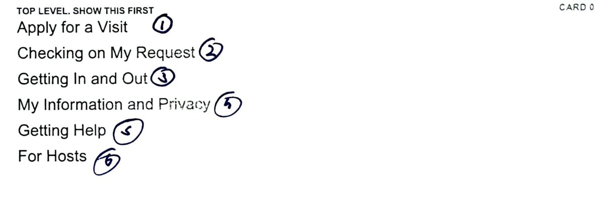
I turned the card sort into a menu with six sections. Then five new students tested it on paper. I read them a situation, like “It’s been an hour and nobody has answered your request.” They pointed at the menu heading that they chose. They saw one level at a time, with no design or search to help them.

The printed top-level menu card used in the test. It lists six headings: Apply for a Visit, Checking on My Request, Getting In and Out, My Information and Privacy, Getting Help and For Hosts. I numbered them one to six in blue ink during the sessions.
The printed top-level menu card. I numbered the headings in pen during the sessions, to note choices quickly.

First choices, one dot per person

A filled dot means the person’s first choice was right. I set the pass marks before testing: 4–5 is good, 2–3 is unclear, 0–1 means the menu is wrong.

Check request status5/5
Read the privacy policy5/5
No phone signal5/5
Choose who I am visiting4/5
Send to a backup approver (my guess: fail)4/5
Add a second visitor2/5
Student registers a guest1/5
Find visiting hours0/5

What I learned, and what I changed

What happenedWhat it tells meChange
I guessed that the backup task fails. It passed, 4 of 5.People knew where it belonged once they had a real reason to look for it.None
Nobody found visiting hours. It took 75 seconds on average. Four of five said that they wanted to call the gate desk.People ask a person about hours. The heading also mixed hours with gate location.Split hours and location
“For Hosts” failed, 1 of 5. Four went straight to “Apply for a Visit”.Students do not call themselves “hosts”. They think “I am arranging a visit.”Removed “For Hosts”
“Add a visitor” went the other way. The card sort said Apply. Three testers chose Checking.On a card, it sounded like filling in the form. In the test, the request was already sent, so it meant changing it.Moved to Checking

The five recording sheets

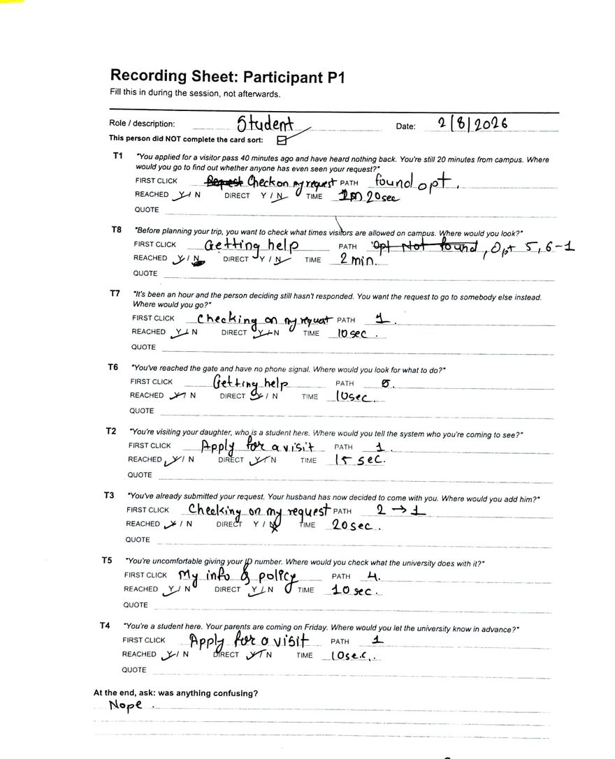
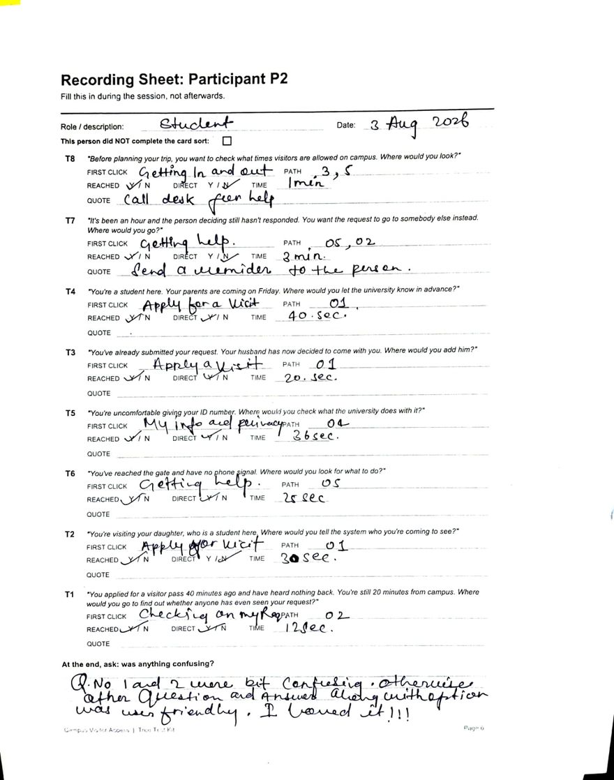
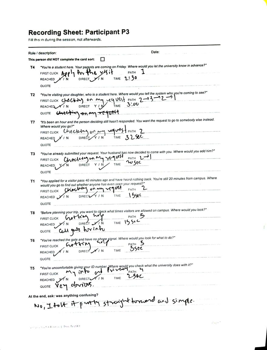
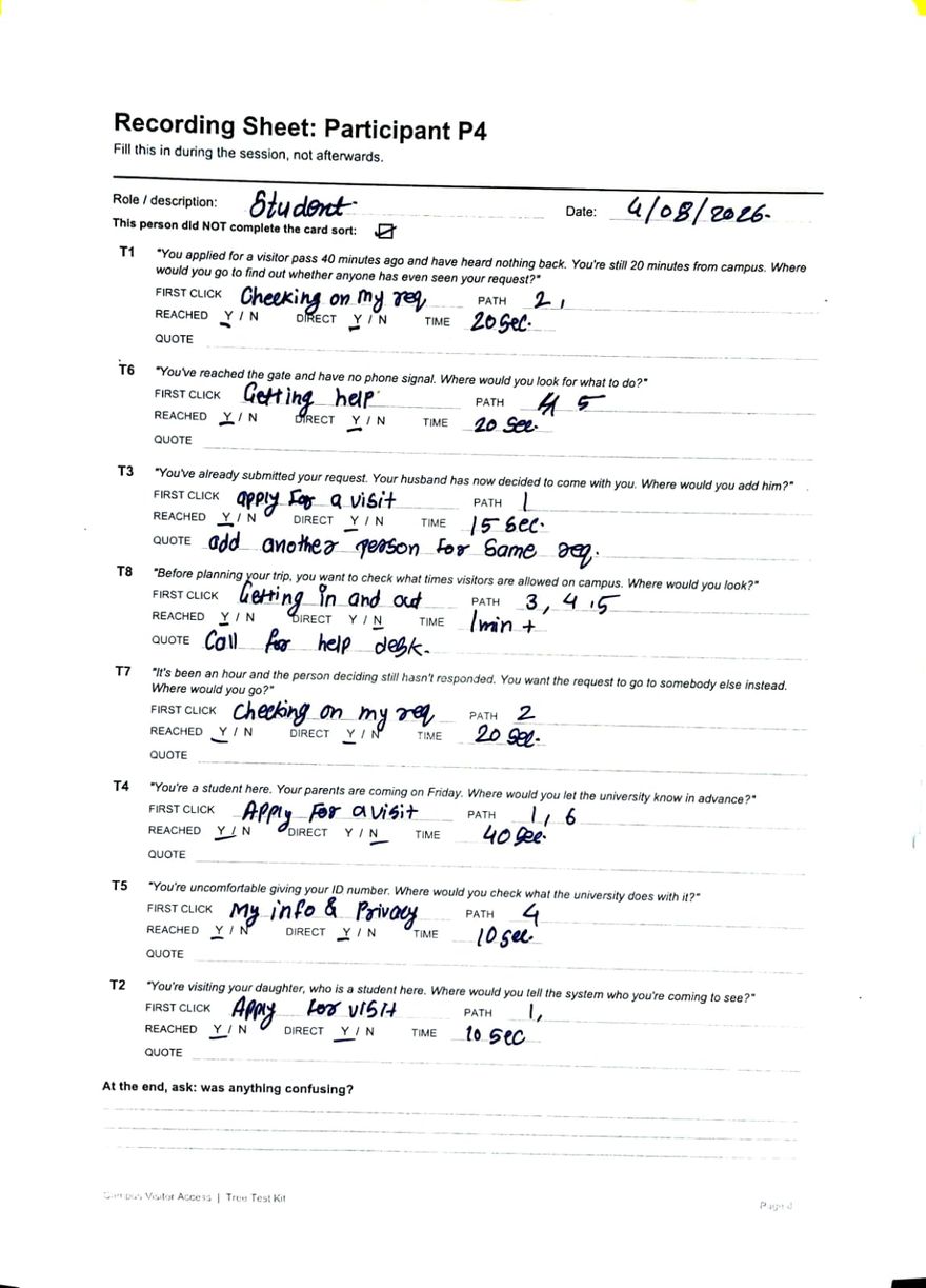
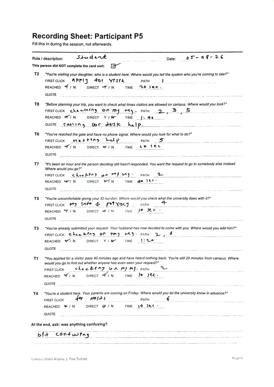
I filled in one sheet per person during each session. Each sheet shows their first choice, path, time and words for every task. Tap a sheet to open it full size.

Handwritten tree test sheet for tester 1, a student, dated 2 August 2026, with entries for all eight tasks. The visiting hours task is marked opt not found after two minutes.
Tester 1
Handwritten tree test sheet for tester 2, dated 3 August 2026. It includes the quotes call desk for help on the visiting hours task and send a reminder to the person on the backup task.
Tester 2
Handwritten tree test sheet for tester 3. It includes the quotes call gate for info on the visiting hours task and very obvious on the privacy task.
Tester 3
Handwritten tree test sheet for tester 4, dated 4 August 2026. It includes the quote add another person for same request, and call for help desk on the visiting hours task, which took over a minute.
Tester 4
Handwritten tree test sheet for tester 5, dated 5 August 2026. The only tester to find the For Hosts heading, in ten seconds.
Tester 5
  • Tester 1, 2 August: gave up on visiting hours after two minutes and wrote “opt not found”.
  • Tester 2, 3 August: the only miss on the backup task. Said “Send a reminder to the person”.
  • Tester 3: said “Call gate for info” for visiting hours, and “Very obvious” for privacy.
  • Tester 4, 4 August: wrote “add another person for same req”. Visiting hours took over a minute.
  • Tester 5, 5 August: the only person to find “For Hosts”, in ten seconds.

The sheets say P1 to P5. On this page they are testers 1 to 5, so they do not get mixed up with the parent and the guards.

The information architecture, after testing

CAMPUS VISITOR ACCESS  (after testing)
├── Request a Visit             renamed from Apply for a Visit
│   └── includes: request a visit for my guest   moved in
├── Checking on My Request
│   ├── status, who has it, backup approver
│   ├── add another visitor         moved in
│   └── guests expected today       moved in
├── Getting In and Out
│   └── gate location               split out
├── My Information and Privacy
└── Getting Help
    └── visiting hours              split out

REMOVED: For Hosts

“Checking on My Request” now has eight items. I thought that was possibly too many, but the tree test gave me no reason to split it. So I wrote it down as the first thing to test next. The usability test later showed that it was too many: only 1 of 8 people found “add a visitor” there.

The first menu and the full results table
CAMPUS VISITOR ACCESS  (first version, from the card sort)
├── Apply for a Visit          name, phone, reason, who 6/8 · add visitor 5/8 · hours 3/8
├── Checking on My Request     opened 8/8 · who has it 7/8 · backup fit no group
├── Getting In and Out         entry pass 8/8 · exit pass 8/8
├── My Information and Privacy ID proof 7/8 · privacy 6/8
├── Getting Help               gate desk 7/8 · no signal 8/8
└── For Hosts                  guest request, guests today my own label
TaskFirst choice rightNo going backMiddle timeWent to instead
Request status5/54/515snone
Privacy5/55/510snone
No signal5/55/520snone
Who I am visiting4/53/520sChecking ×1
Backup approver4/54/532sHelp ×1
Second visitor2/52/520sChecking ×3
Student registers1/54/540sApply ×4
Visiting hours0/51/575sHelp ×2, In and out ×2, Checking ×1

Four people went straight to the wrong place for “student registers a guest”, with no going back. They were sure, and they were wrong. I also marked every task as “reached” on the sheets, even when the path shows the person never got there. So I used first choices and paths, not the “reached” column.
Four must-haves

I listed 27 ideas: 21 from the menu and 6 that people suggested. I grouped them into features, then sorted them into Must, Should, Could and Won’t. The first version had room for only four must-haves.

  1. Send a request from anywhere, with five fields. Use a web link, so visitors do not need the QR code at the gate. Ask only for name, phone, address, reason, and who you are visiting.
  2. The system picks the approver. It uses the person you are visiting. Visitors never type a staff name.
  3. Visitors can see the status. They see if someone opened the request, and who has it.
  4. A backup approver after a time limit. If nobody answers in time, the request moves on by itself. This is the only feature that fixes her worst moment.

Should have (7)

Student registers a guest · digital entry pass · alert when decided · remind the approver · add a visitor · gate desk number · pass that works offline

Could have (8)

Reuse last visit · visiting hours · gate directions · exit pass · guests expected today · usual decision time · time slots · privacy notice

Won’t have (4), and why

Selfie, ID digits and car number
The guards do not use them. Also, you can add a field later, but you cannot take back data once you collect it.
Students approve their own visitors
The university chose to give approval to a few office staff. The university will refuse a feature that undoes that choice.
Emergency button
Nobody is in charge of answering it, and it has no time limit. It becomes one more request that waits.
Chat with the person you’re visiting
Everyone already uses WhatsApp. Also, a visitor who knows nobody inside has no one to message.

DFV matrix: choosing the fourth must-have

Two features competed for the last spot. I scored each from 1 to 5 on three things: Desirability (do people want it), Feasibility (can we build it) and Viability (will the university accept it). I wrote down what each score meant before I scored.

Score, 1–5Backup approver after a time limitStudent registers a guest
Desirability53
Feasibility42
Viability42
Total137

Desirability: four sources point to the backup approver, and one card-sort person asked for it on their own. The student option mainly helps visitors start early, and the web link already does that.

Feasibility: the backup approver is a timer and a rule. The student option needs student logins, a new user type and a link to the student records.

Viability: guards already phone backup people by hand. The backup approver just does that for them. The student option goes against the university’s choice to keep approval with a few staff.

What each score meant, set before scoring
ScoreDesirabilityFeasibilityViability
1Only my own guessNew systems and outside linksUndoes a university decision
2Guessed from one sourceNew user type, login or outside linkNeeds a new rule and adds risk
3One person asked for itSome changes to what existsNeeds a rule, low risk
4Several separate sourcesA rule or timer on existing dataWrites down something people already do
5Several sources, someone invented it, and it fixes the worst momentOnly settingsSaves money, no new rules

The four must-haves as screens

I drew the screens as gray wireframes. Then I checked them against Nielsen’s heuristics and fixed what failed. Last, I linked them into a prototype you can click.

1. Wireframes

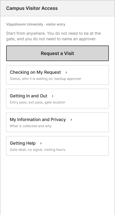
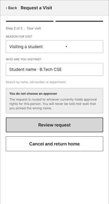
There are sixteen phone screens. Eight show the main path from home to approval. Five show errors and problems. Three are information pages. Here are five of them.

Wireframe of the home screen: a Request a Visit button and four sections, Checking on My Request, Getting In and Out, My Information and Privacy, and Getting Help. These match the tested menu.
Home. Uses the tested menu.
Wireframe of step 2 of 2: reason for visit set to Visiting a student, a Who are you visiting field you can search by name, roll number or department, and a note that the visitor does not choose an approver.
Who you’re visiting. You name the student, and the system finds the approver.
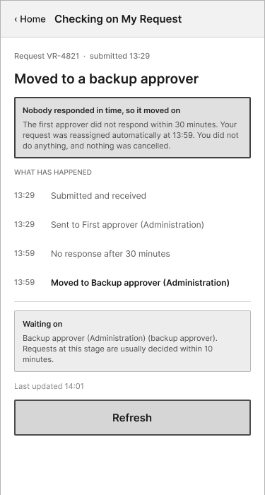
Wireframe of the waiting screen, showing three stages, who has the request now, and a countdown to when it moves to a backup approver.
Waiting. Shows who has it, and when it moves on.
Wireframe of the moved-to-backup screen: nobody answered in 30 minutes, so the request moved to a backup approver at 13:59. A timeline shows each step, and nothing was cancelled.
Moved to backup. Happens by itself. Nothing is cancelled.
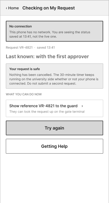
Wireframe of the no-signal screen: it shows the status saved at 13:41, says the request is safe and the timer keeps running at the university, and suggests showing the reference number to the guard.
No signal. The request is safe, and the timer keeps going.

Scroll sideways to see all five. Open all sixteen screens as one image.

2. Heuristic inspection

I checked my first sketches against Nielsen’s ten usability heuristics. Three failed. Each failure brought back a problem from the research.

Visibility of system status

SketchThe status said only “Pending approval”. It did not say if anyone had opened it, who had it, or how long was left.

WireframeIt shows three named stages, who has the request, and how many minutes until it moves on. A “last updated” time shows when the screen is out of date.

User control and freedom

SketchOnce you started the form, the only button was Continue. There was no way to go back or leave.

WireframeEvery screen has Back. Each form step has “Cancel and return home”. A pop-up tells you your details stay saved if you leave.

Error prevention

SketchStep 2 asked you to type the approver’s name. That is the same mistake that left the parent waiting.

WireframeIt asks who you are visiting. There is a review screen before you send. If a name is not found, the screen explains why and gives other ways to search.

3. Interactive prototype

This is the Figma prototype that eight people tested in September. Tap the buttons to move between screens. If you tap a spot that does nothing, Figma briefly shows the spots you can tap. The rebuilt version is in the demo.

If the prototype does not load, open it in Figma.

Main path

Request a Visit → About you → Your visit → Review → Sending → Waiting → Refresh → Moved to backup → Refresh → Approved.

Error screens, and how to reach them

  • Tap the phone number box: wrong number
  • Tap “Who are you visiting”: name not found
  • Tap “Last updated”: no signal
  • Tap “Waiting on” after the move: request declined
  • Tap Cancel on a form step: leave pop-up
Where each must-have appears
Must-haveScreens
Send from anywhere, five fieldsHome, the two form steps, review
The system picks the approver“Who are you visiting”, name not found
Visitors can see the statusWaiting, no signal
Backup approver after a time limitWaiting countdown, moved to backup, approved

What happened when people tried it

Eight people tested the Figma prototype on 16 and 17 September 2026. Each person worked alone, from a Google Form. The form gave them eight tasks, like “nobody has replied to your request”. After each task, it asked if they managed it, how easy it was, and what the screen told them.

Two people were a parent or relative of a student. Four were students. One was a working professional and one chose “Other”. Five used a phone and three used a laptop.

97%of tasks were reported as done
62 of 64
44%of answers showed real understanding
28 of 64

I checked each answer against what the screen really shows. Most people said they managed the task, but less than half understood the screen. In a test with no observer, “I managed it” measures confidence, not understanding. So every result below comes from the answers and the comments, not from what people said they managed.

Understood the screen, one dot per person

A filled dot means the person’s answer matched what the screen shows. Rows with fewer than half are marked in red.

Stop halfway6/8
Who has my request5/8
No signal at the gate4/8
Request declined4/8
Send a request3/8
Nobody replied3/8
Name not found2/8
Add a second visitor1/8

Four problems stood out.

  1. A sent request looked like an approved one

    Five of eight people thought the waiting screen meant that they had permission to enter. The screen said “Waiting for a decision”. But it also said the request “moves to a backup approver at 13:59”, and people read that time as a promise. This is the worst result, because the whole design exists to stop false confidence at the gate. Both approvers were also named only “Administration”, so people did not know which was which.

    Shows my reference number and that im allowed to enter.

    Test participant
  2. Nobody found how to add a visitor

    Only 1 of 8 went to “Checking on My Request”, where this task lives. Six went to “Request a Visit” and were about to make a second request. The tree test said the opposite: 3 of 5 chose Checking. The tree test showed only the heading. The usability test showed the heading with a subtitle that sounded read-only. A tree test measures whether a label fits, not whether people see what they can do there.

    Nothing on the menu mentions adding a person or group visitors.

    Test participant
  3. People wanted a phone number

    When nobody replied, two people chose to call someone. One chose to cancel and apply again, which is the habit that the current system teaches. No status or error screen had a gate desk number. The backup approver is a good idea, but people still want a person to call.

    Would like a call or help option on this screen in case the backup is also slow.

    Test participant
  4. Two labels said the wrong thing

    “Cancel and return home” sounded like it deletes your details. The pop-up then said the details stay saved. The “name not found” screen showed a professor’s name to a parent who was looking for their child.

What worked

  • 6 of 8 understood that their details stay saved if they leave the form.
  • 5 of 8 correctly named who had their request.
  • People who read the backup approver screen understood it and trusted it. Three people explained it correctly in their own words.

Yes seems very reliable regardless of you losing connection.

Test participant
Faults in the prototype itself, counted apart from the design

These faults came from how I built the Figma file, not from the design. They cost people some tasks.

  • The Refresh button moved the clock 32 minutes, but the task said 10 minutes had passed.
  • To see the no-signal screen, you had to tap “Last updated”. One person gave up on that task.
  • To see the declined screen, you had to tap “Waiting on”.
  • A note that I wrote for myself was visible on the leave pop-up.
  • On a laptop, the bottom of two screens was cut off, with no scroll. All three laptop users had problems that no phone user had. I built and checked the prototype only on a phone frame.
How much to trust these numbers: four of eight people gave answers with a quality problem
  • One person said every task was easy, but rated 7 of 8 tasks as very hard. They probably read the scale backwards. I left their ratings out of the ease scores.
  • Two people gave the top rating to every task. One of them gave the system a perfect score, but got four of eight tasks wrong.
  • One person gave answers that match no screen in the prototype.
  • The observer part of the form is empty for all eight people. So every result here is what people said, not what I saw them do.

The ease rating for each task was 6 or 7 out of 7, even for the task that only one person got right. So I do not use the ease ratings as evidence.

The System Usability Scale (SUS, a standard 10-question score out of 100) had a mean of 76.9 and a median of 81.3. The usual benchmark is 68. But with eight people and scores from 32.5 to 100, the number tells me very little.

SUS score for each person
Person12345678
SUS87.570.032.590.062.597.575.0100.0

What I changed after testing

I rebuilt the app as a working web page, not a set of linked pictures. Each change below answers one problem from the test. On the left is the wireframe that people tested. On the right is the new version. Tap an image to open it full size.

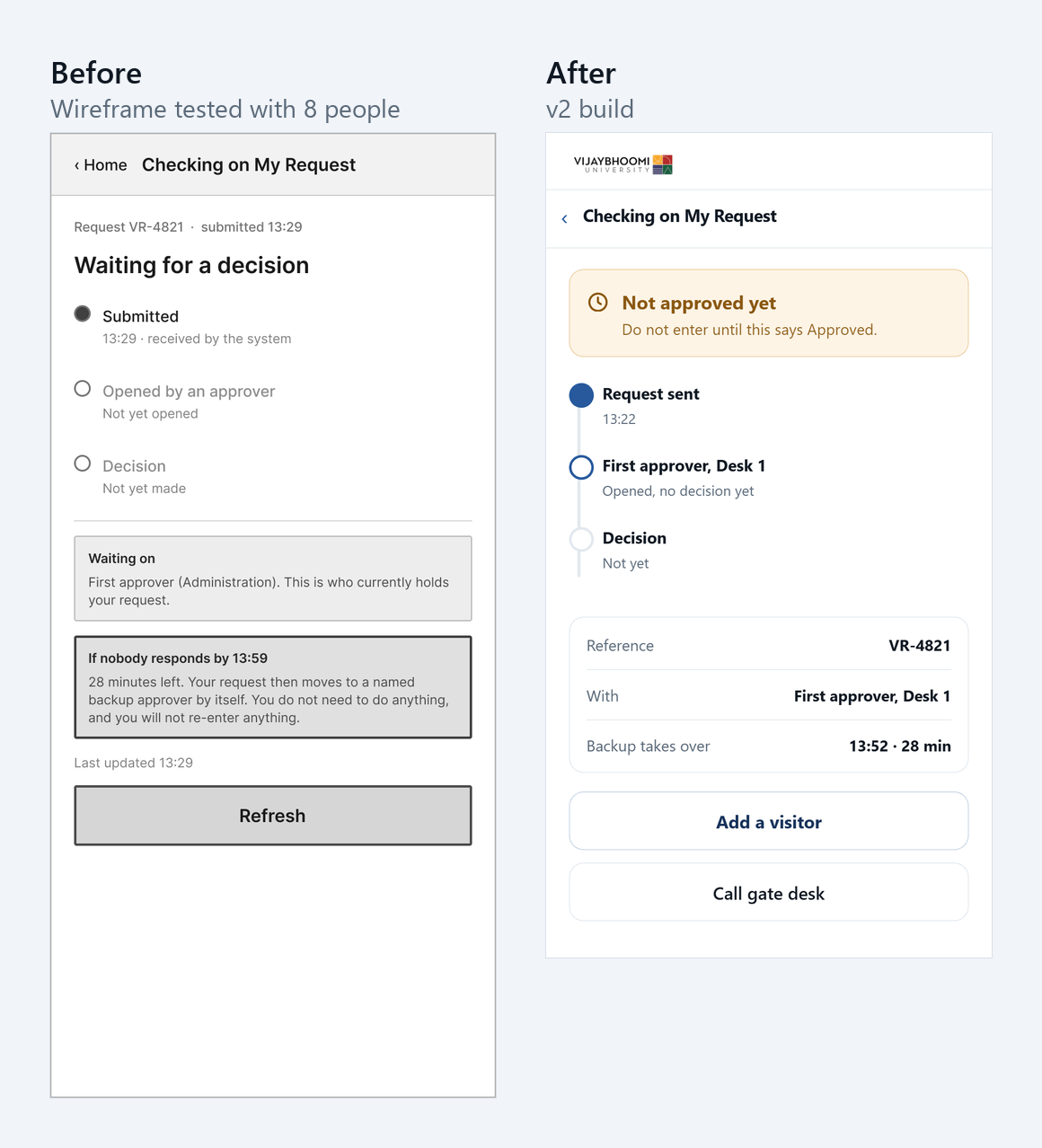
Before and after of the waiting screen. Before: the heading Waiting for a decision, three stages, and a box that says if nobody responds by 13:59 the request moves to a backup approver. After: an amber box that says Not approved yet, Do not enter until this says Approved, a timeline with First approver, Desk 1, and buttons for Add a visitor and Call gate desk.
Waiting. The screen now starts with “Not approved yet”. The countdown is one line in a list. “Add a visitor” is a button on this screen.
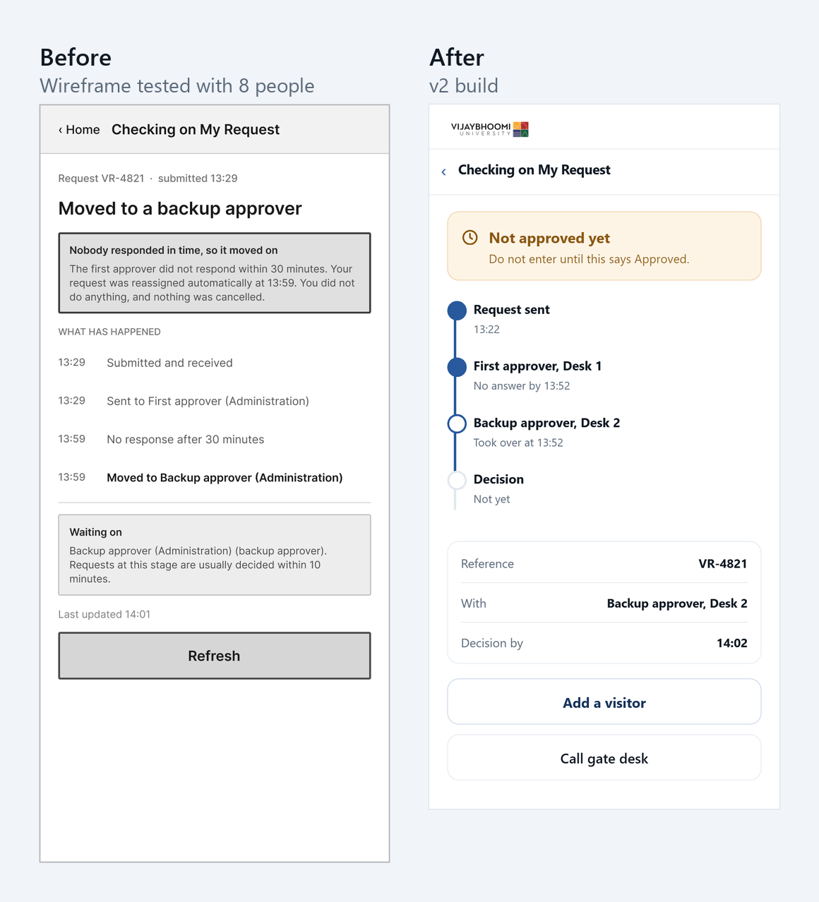
Before and after of the moved-to-backup screen. Before: both approvers are called Administration. After: the timeline shows First approver, Desk 1, with no answer, and Backup approver, Desk 2, who took over. The amber Not approved yet box stays at the top.
Moved to backup. Each approver has a desk number, so people can tell the first approver from the backup.
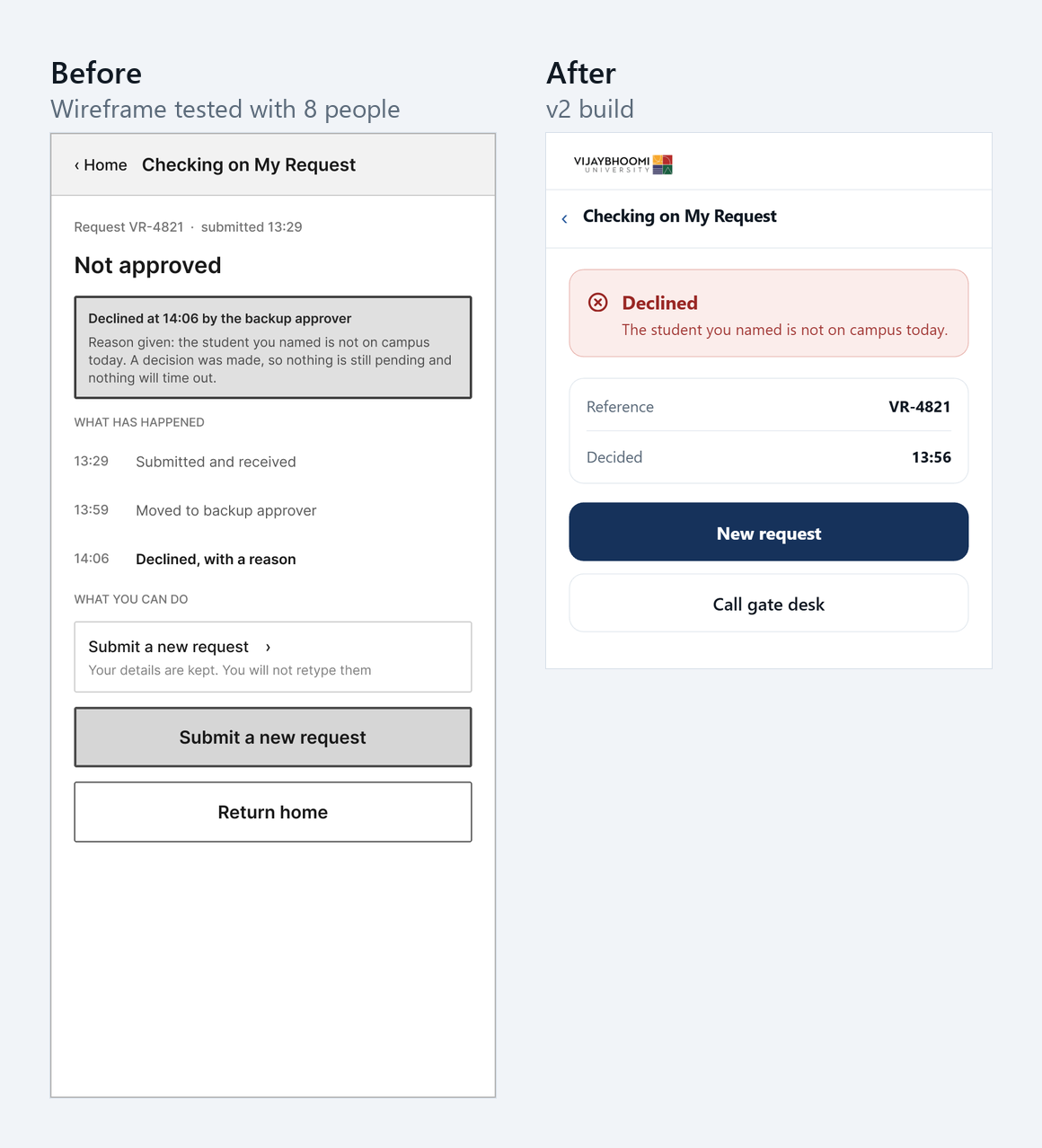
Before and after of the declined screen. Before: a declined message with Submit a new request shown twice. After: a red Declined box with the reason, a New request button, and a Call gate desk button.
Declined. Every status screen now has a “Call gate desk” button. The number is also under Getting Help.
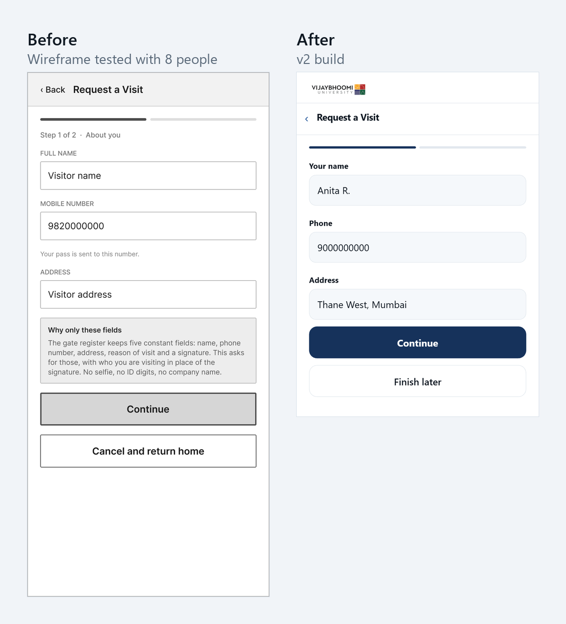
Before and after of leaving the form. Before: a button labelled Cancel and return home. After: a button labelled Finish later, which opens a sheet that says everything you typed is saved and nothing is sent.
Leaving the form. “Cancel and return home” is now “Finish later”.
Each change and the evidence for it
Problem in the testChangeEvidence
A sent request looked approvedStart with “Not approved yet. Do not enter until this says Approved.”5 of 8
Nobody found how to add a visitor“Add a visitor” button on the status screen1 of 8 found it
People wanted a phone number“Call gate desk” on every status screen and on the pass3 of 8, and two direct requests
First and backup approver looked the sameDesk 1 and Desk 21 person
“Cancel” sounded like delete“Finish later”1 person
A professor’s name on the parent’s error screen“Staff no longer approve visits. Name the student you are seeing.”1 person

The new version has the four must-haves. It also has four should-haves that the test gave evidence for: add a visitor, a gate desk number, a digital pass, and a pass that works with no signal. It has nothing from the could-have or won’t-have lists.

Try the rebuilt app

This is the working version. It runs in your browser and sends nothing anywhere. Its clock runs fast: one minute passes about every half second.

If the demo does not fit your screen, open it in its own tab.

What to try

  1. Tap Request a Visit. Type a 10-digit phone number.
  2. Pick a reason and type a student’s name. Send the request.
  3. Watch the status screen. After about 15 seconds, the request moves to the backup approver by itself. About 5 seconds later, it is approved.
  4. Tap Open pass to see the entry pass.

Other screens

  • Type a phone number that is not 10 digits: phone error.
  • Type a name with “Prof” or “Dr.” in it: name not found.
  • On a keyboard, press D to decline the request, T to skip 10 minutes, or R to start again. Click the demo first.

I have not tested this version with users yet. The next test starts here.

How three other studies solved the same problem

Three classmates studied other campus systems. We shared our written studies and compared them. I did not use a live demo, because a written study shows the evidence behind each choice.

All four of us found the same problem on our own: after you send a request, nothing tells you what happens next. In one classmate’s survey, 67% of people had waited for an approval with no status. But we chose four different answers.

StudyAnswer to the waitingIt needs
Office request trackingPredict: show the expected date the request is doneStaff who work at a steady speed
ComplaintsName the owner: show which department has the complaintRules that send each complaint to an owner
Classroom bookingShow it early: show free rooms before you askA timetable that already exists
Visitor access (mine)Act: move the request to a backup on a timerA rule and a clock

Only my answer still works if staff do nothing. The other three tell the user about a stuck request, but they do not move it. My answer has a cost: the university must agree who the backup approver is. That is harder than adding a date to a screen.

What I learned from them

  • Show a usual decision time. The office-requests study shows an expected date. My waiting screen shows only when the backup takes over, and five people read that as a promise. A usual decision time moves up from could-have.
  • A phone number helps an outsider. The office-requests study cut “contact the department”, because students already phone too much. My visitor is outside the gate and knows nobody. So I added the gate desk.
  • Merge or link? The classroom study had the same problem as my “add a visitor” task. People crossed between two menu sections. That study merged the two sections and tested the result. I kept my sections and put a button on the status screen. I have not tested a merged menu, so this question is still open.
  • Finishing is not understanding. The complaints study had every tester finish every task, but saw them hesitate between two labels. My 97% against 44% is the same lesson, in numbers.

What this design changes for her

  • She does not need a staff member’s name, and she does not give her Aadhaar digits
  • She sees that her request is not approved yet, and who has it
  • After 30 minutes, the request moves to a backup person by itself. Nobody cancels it while she stands in the rain
  • If it is still slow, she can call the gate desk from the same screen

What I will do differently

  • Watch the next test. The form-only test gave four answers out of eight with a quality problem, and no observer notes. The next round will have 3 to 4 people, with a shared screen, talking aloud as they work. It starts with adding a visitor and the waiting screen.
  • Test a merged menu. The tree test and the usability test disagree about where “add a visitor” belongs. I will test one section for requesting and checking against the current five sections.
  • Test on a laptop too. I built and checked the prototype only on a phone frame, and all three laptop users had problems because of it.
  • Test with more real parents. The tree testers were all students. The usability test had two parents or relatives out of eight.
  • Write the proto-persona before the interviews. I wrote mine afterwards, so I cannot prove which came first.
  • Add a “not sure” choice to the card sort. A participant pointed this out, and they were right.