Campus Visitor Access
a UX research study of a university entry system
The form is genuinely irritating. It is not the problem.
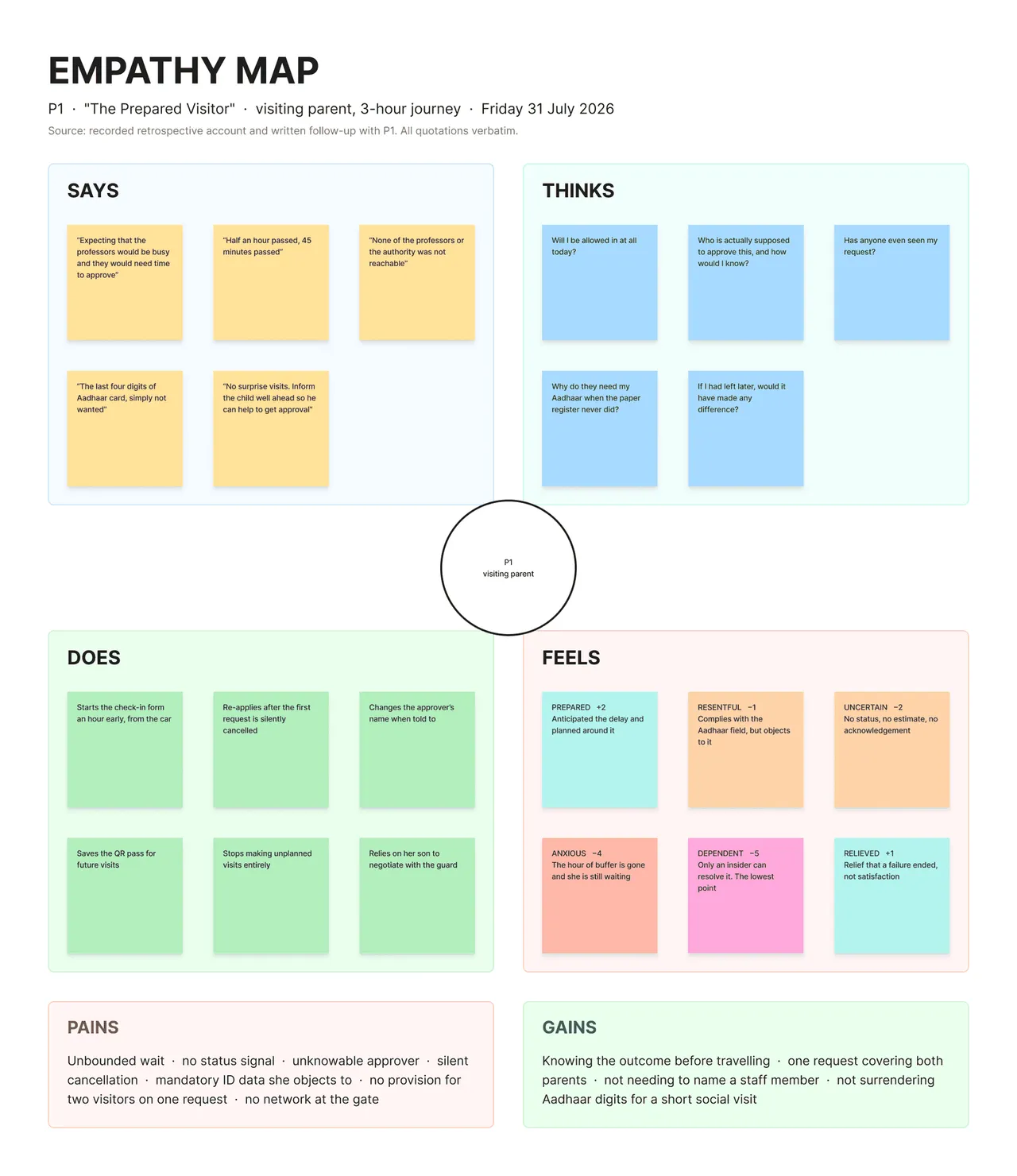
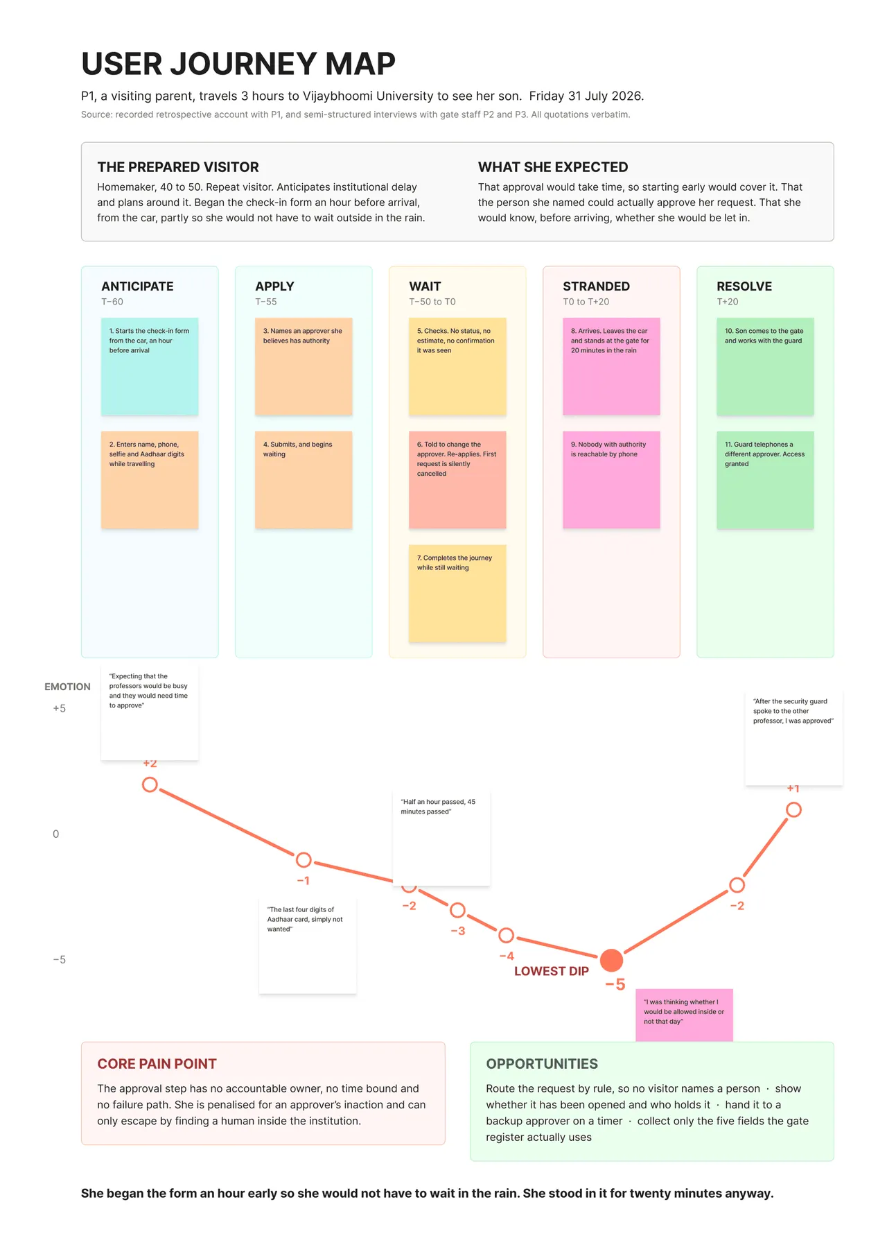
A parent travelled three hours to visit her son, started the check-in form an hour before she arrived so she would not be caught out, and still ended up standing in the rain outside the gate. She got in when somebody inside the university made a phone call. The system had nothing to do with it. This study is about why that happens.
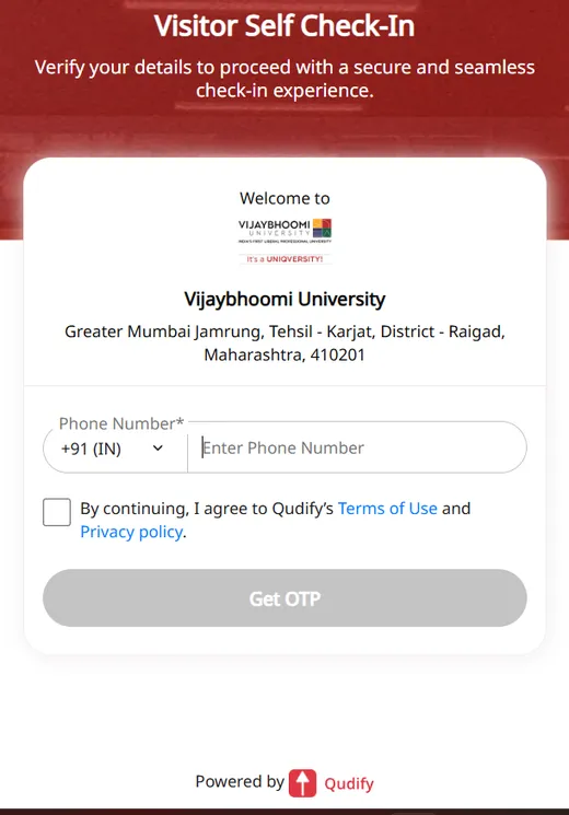
Entry runs through a third-party visitor management system. A visitor fills in six screens at the gate, then waits for a host to approve the request before a pass arrives over WhatsApp. Fixing the form moves the emotion line on the journey map from minus one to zero while the trough stays at minus five, which is the finding that decided the rest of the work.
The approval step has no accountable owner, no time bound and no failure path. If the named person does not act, nothing is rejected: the request is held, then silently cancelled, and the visitor begins again. The guards cannot rescue anyone either, because they do not know who the correct approver is; they call a shortlist and hope somebody answers. Silence is the failure mode, and silence has no recovery path.
Underneath that sits a modelling problem. The system knows about visitors and it knows about approvers, but it does not know about the relationship that motivated the visit, so the person you came to see has no standing to let you in. The recommendation is a timer: if the first approver has not responded inside an agreed window the request reassigns itself to a named fallback, with the visitor doing nothing and re-entering nothing. It is the one state the current system does not have, and it is already what the guards improvise over the phone.
Fieldwork ran from 31 July to 5 August 2026 and every participant is anonymised. The study site is plain HTML and CSS with no JavaScript, no dependencies and no build step, which is the same reason this portfolio is built the way it is.
- HTML 75.2%
- CSS 24.8%
Built from
Scope
- Research, sensemaking and information architecture. No interface was designed, deliberately: the work was to find where the system breaks and show the reasoning that got there.
- A small sample, stated plainly rather than generalised: three interviews, eight valid card sorts, five tree tests.
Screenshots